


Understanding Icons: Definition and Importance
What are Icons?
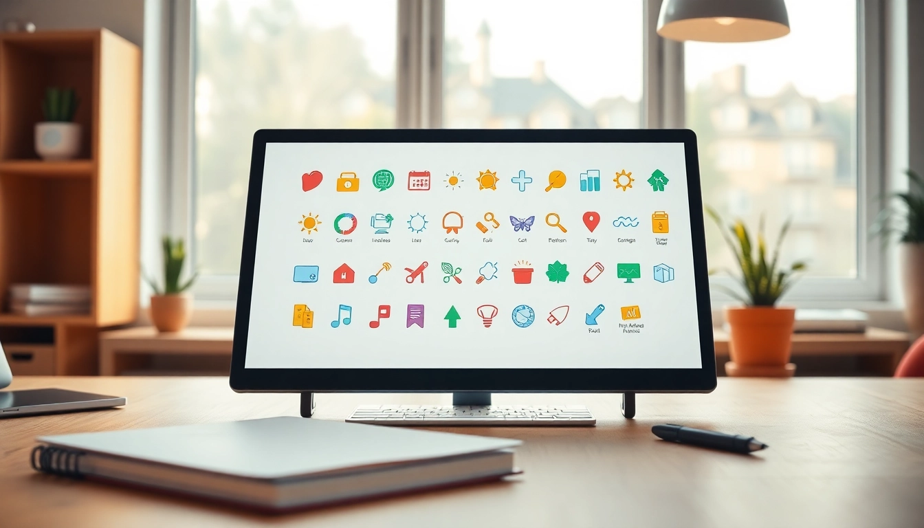
Icons serve as visual representations that convey ideas, actions, or objects in various forms of media, particularly in digital design. They often consist of minimal graphic elements that can be understood intuitively without the need for text. These tiny images can signify a wide range of concepts, from navigation and communication to branding and functionality, making them indispensable in user interface (UI) design. Icons streamline communication and enhance user experience by encapsulating complex messages into easily digestible visuals.
The Role of Icons in Digital Design
In the realm of digital design, icons are not merely decorative elements; they play a crucial role in enhancing usability and aesthetics. A well-designed icon can effectively guide users through applications and websites, facilitating quick decision-making. For instance, a straightforward “home” icon allows users to effortlessly return to the homepage. Icons also contribute to the visual hierarchy of a page, directing attention to essential features or functionalities. Moreover, they help create a consistent brand identity, as unique icons can embody the personality of a brand and differentiate it from competitors.
Icons vs. Symbols: Key Differences
While the terms “icons” and “symbols” are often used interchangeably, they represent distinct concepts in design. Icons are typically graphic representations that stand for objects, actions, or ideas, while symbols carry a deeper, often emotional meaning related to cultural context or shared knowledge. For example, a heart icon straightforwardly indicates love, while the shape itself as a symbol resonates with various interpretations based on cultural backgrounds. Understanding the difference is vital for designers to ensure that the intended message is conveyed appropriately.
Types of Icons and Their Uses
Static Icons
Static icons are the most prevalent type of icons found across digital platforms. They do not change or animate but provide clear, direct communication of their intended function or message. Static icons are commonly employed in toolbars, buttons, and navigation menus, offering a straightforward way for users to identify functions such as “settings” or “search.” The simplicity and clarity of static icons make them an optimal choice for essential functions, as they reduce cognitive load and enhance usability.
Animated Icons: Advantages and Applications
In contrast to their static counterparts, animated icons are dynamic visual elements that can change in shape or color to capture user attention or reflect interactions. These icons can enhance user experience by providing feedback during actions, such as indicating loading states or completing tasks. For instance, an animated download icon may spin or change color while files are being retrieved, giving users immediate feedback that their action is processing. Animated icons can also be utilized in tutorials or onboarding processes, guiding users through features in an engaging manner. However, designers must strike a balance: overusing animation can distract users rather than assist them.
Custom Icons: When and Why to Use Them
Custom icons allow brands to tailor visual representations that align perfectly with their identity and messaging. Unlike stock icons, which may be recognizable to many, custom icons can help brands stand out and convey unique attributes. For example, a tech company might use custom icons that integrate elements of its branding, such as colors and shapes that reflect its aesthetic. Designers should consider creating custom icons when they wish to enhance brand recognition, provide a distinct user experience, or communicate complex or unique concepts that existing icons cannot adequately represent.
Best Practices for Icon Design
Choosing Color Palettes for Icons
The color palette of icons plays a significant role in their effectiveness. Colors evoke emotions and can influence user behavior. When designing icons, it’s essential to choose colors that not only align with the brand’s identity but also enhance visibility and comprehension. For instance, using contrasting colors can make icons more noticeable and ensure that they are interpretable across different backgrounds. Designers should also consider color-blind users and employ universally distinguishable colors to ensure inclusivity.
Consistency in Iconography Across Platforms
Consistency is key in any design piece, and iconography is no exception. Icons should maintain a uniform style, shape, and color scheme across platforms (web, mobile, print) to ensure that users can identify them effortlessly, regardless of where they encounter them. This consistency reinforces the brand’s identity and helps users build familiarity with the navigation and functionalities of a product. Establishing well-defined icon guidelines within design systems can help maintain this consistency across teams and projects.
A/B Testing Icons for User Engagement
A/B testing, or split testing, is a method that allows designers to compare two variations of an element—like icons—to determine which performs better in engaging users. By testing different styles, sizes, and placements of icons, designers can gain insights into user preferences and behaviors. For example, a simple change in color or a slight alteration in shape might significantly impact click-through rates on call-to-action buttons. Implementing A/B testing in the design process ensures that the chosen icons align with user expectations and improve overall interface effectiveness.
Sourcing Quality Icons
Free vs. Premium Icon Resources
When sourcing icons for projects, designers often face the decision between free and premium resources. Free icon libraries, such as those available on platforms like Icons, provide a vast selection of icons at no cost, making them appealing for budget-conscious designers. However, they may lack unique styles or high-quality design. On the other hand, premium resources often come with exclusive designs, high resolutions, and comprehensive licensing options, which can be beneficial for professional projects but require an investment. Understanding the needs of a project can guide the decision-making process regarding icon sourcing.
How to Properly License Icons
Licensing icons correctly is crucial to avoid legal issues that may arise from unauthorized use. Each icon resource typically comes with specific licenses that dictate how icons can be used. Free icons may require attribution or have restrictions on commercial use, while premium icons usually come with more flexible licenses. It’s essential for designers to read and understand these licensing agreements before integrating icons into their projects. Some licenses allow modification, while others may not, impacting how icons can be adapted to fit brand requirements.
Exploring Open Source Icon Libraries
Open source icon libraries offer a treasure trove of options for designers looking for free resources. Platforms like Font Awesome and Material Icons provide vast libraries that are accessible for both personal and commercial use, often under permissive licenses. These libraries not only promote community contributions but also allow designers to modify the icons to fit their unique style or brand needs. However, it is essential to assess the quality and design consistency of open source libraries, as not all contributions meet professional standards.
Future Trends in Icon Design
Minimalism and Flat Design: The Continuing Influence
Minimalism and flat design have significantly shaped how icons are designed in recent years. As user interfaces strive for simplicity, designers increasingly favor flat icons that eschew gradients and complex textures in favor of crisp lines and solid colors. This trend not only enhances visual clarity but also improves loading times and adaptability across devices. The focus remains on creating intuitive designs that honor functionality, ensuring that icons remain effective at conveying messages without unnecessary complexity.
Icons in Augmented Reality
As augmented reality (AR) technology matures, icons are evolving to fit new dimensions within virtual environments. In AR applications, icons need to interact with real-world elements, making their placement and proportional sizing essential factors in design. For instance, icons might hover above objects to indicate more information, requiring designers to rethink how icons behave and appear in a three-dimensional space. This trend presents exciting opportunities for designers to push creative boundaries and enhance user engagement in immersive experiences.
The Growing Use of 3D Icons
Incorporating three-dimensional design into icons is becoming more common as technology advances. 3D icons add depth and realism, potentially improving user interaction by creating a more engaging experience. However, creating 3D icons requires skill in modeling and rendering, as well as a strong understanding of lighting and shading principles. Designers must ensure that while 3D icons can convey a more lifelike quality, they do not compromise usability or clarity, striking a delicate balance between aesthetics and function.